The Patient Chart
Company: Eon
Product: Eon Direct
Role: Lead Product Designer
Tools: Figma, Pendo, Font Awesome

Work Preview
Company Overview
Eon is a market leader in the identification and tracking of potentially malignant incidental findings.
Product Overview
Eon's proprietary SaaS product, Eon Direct, uses computational linguistics to comb through radiology reports and identify suspicious observations and their essential characteristics.
Eon's team of clinically trained nurse navigators then utilizes the system to assess these observations, determine their risk levels, and establish appropriate patient follow-up protocols.
This process is complemented by the continuous tracking and management of these findings to optimize patient outcomes, executed collaboratively by the system and Eon's communication team.
The Challenge
I was tasked with redesigning the user experience of Eon Direct to increase system efficiency, allowing the existing team of nurse navigators and communication team members to handle a greater volume of patients.
The Research
Research Overview
Eon Direct is a complex system that serves a very specific clinical need in incidental cancer detection. The legacy system’s user experience was very open ended, allowing navigators and communicators to use it at their discretion, without following a rigid process.
To evaluate its user experience for efficiency, I needed to first understand how users were using the system to impact clinical outcomes and the purpose behind their processes and actions.
I had a unique advantage during my research in that many Eon Direct users are internal team members working on behalf of hospital enterprises. Instead of infrequent and formal interactions, I engaged with them on a daily basis. I spent my first few weeks at Eon primarily observing team members in their roles, while seeking insight and clarification through questioning.
As I deepened my understanding of the system and the behavior of its users, it became evident that the patient chart played a central role in users' activities and decision making and was, therefore, integral to the application's efficiency. I decided to make it a top priority for the redesign. My interactions with users became increasingly focused as I began an iterative process to uncover why the patient chart was slowing down the team and how to improve its efficiency. I continuously alternated between creating versions of the chart and observing and interviewing users until we reached a point where we believed we could significantly increase their productivity.
The Legacy Patient Chart

Example User Observation
The steps below illustrate a typical example of how a user may interact with the legacy patient chart to process a patient with an incoming exam.
Open the chart for a patient with an incoming incidental lung nodule finding that needs processing.
Open the modal for the most recent exam.
Examine the nodules characteristics, like attenuation and calcification.
Determine that based on the above characteristics, if the nodule was previously discovered and has remained stable in size for six months, then the follow-up can be extended from 6 months to 12 months to reduce radiation exposure.
Exit the most recent exam modal.
Click in and out of the modals for the patient’s previous exams to compare the states of the nodule to assess the stability of the finding.
Determine that the finding has remained stable.
Open the patient demographics modal to check the patient’s smoking history.
Discover that the patient is a smoker, prompting consideration of specifically the calcification attribute.
Realize you do not remember the calcification status.
Reopen the modal for the most recent exam to review the calcification status.
Refresh memory on calcification status.
Determine that based on the calcification status, a 12 month follow up is still appropriate.
Exit the most recent exam modal.
Open the modal to add the follow-up, but encounter difficulty recalling the exact date of the previous exam.
Close the follow up and refresh your memory on the most recent exam date.
Reopen the modal to add a follow-up and add a 12 month follow up.
Key Insights
The modal system used to organize and access patient information wastes time and burdens the user’s cognitive resources.
In order to make important clinical decisions, users must analyze and compare a range of data to form a comprehensive picture of the patient and their incidental finding. However, the legacy system’s modal structure forces users to waste time toggling in and out of overlays to retrieve this information. This user experience also burdens the user’s working memory, adding unnecessary cognitive load that further slows the process and increases the risk of error.
Users consider 10% of the available information every time they view a patient chart, but the visual hierarchy of the user experience does not prioritize this information.
While all patient information is relevant at times, users consistently rely on the same 10% when accessing a patient chart. However, this critical data is not easier to identify, digest, or access. This results in wasted time as users sift through visually indistinguishable data groups.
The Solution
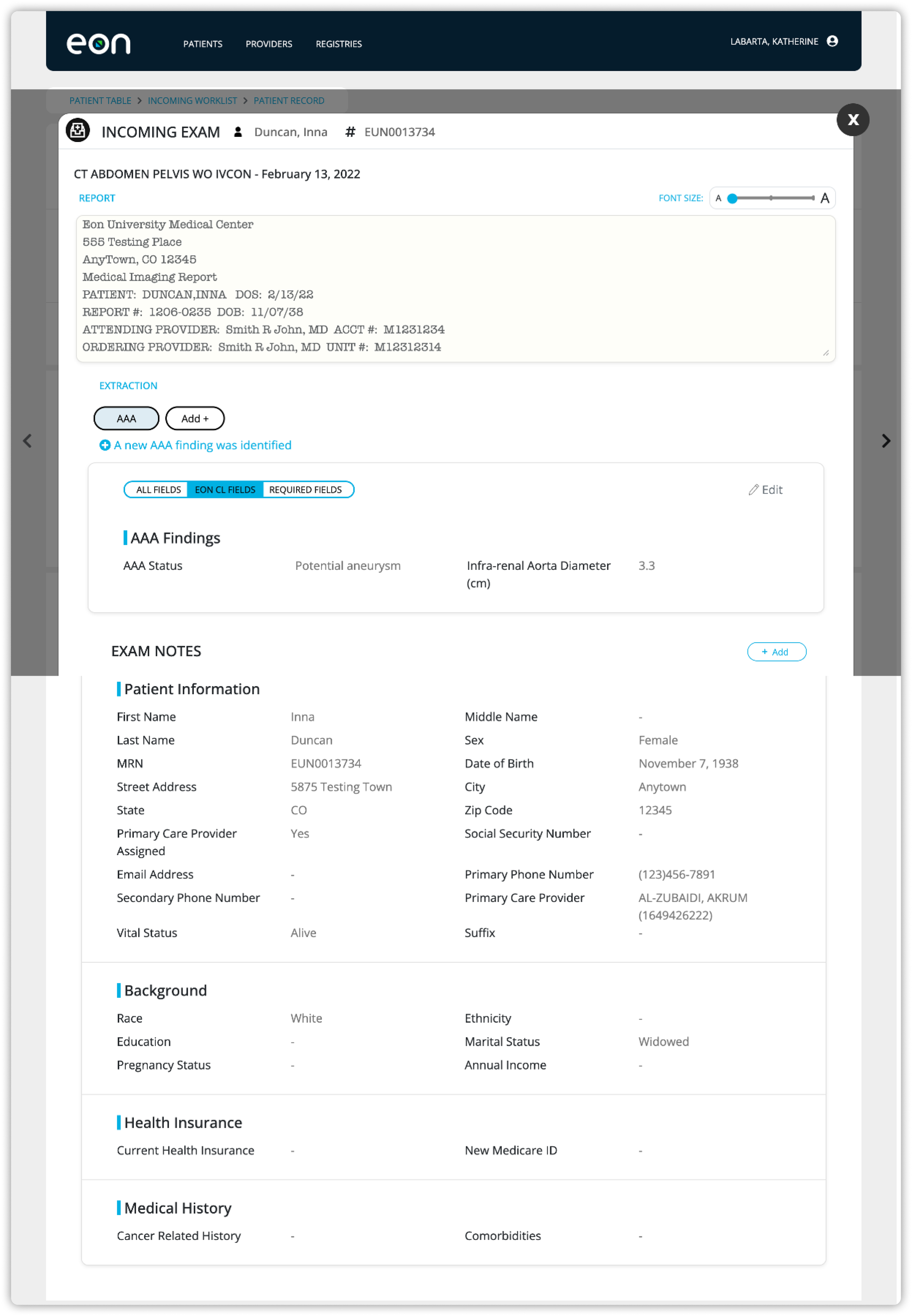
My solution breaks the page into two independently scrolling sides: one for patient data and one for exam data. On the patient side, I transformed information categories into dropdowns, so the user can skim through a list of data groups that barely exceeds the height of their viewport to locate the information they are looking for. This user experience eliminates the need to ever scroll through pages and pages of text fields.
Additionally, I incorporated a patient header that sticks to the top of the page and displays the most essential patient data to the user at all times. To optimize readability, it uses icons to eliminate text field labels and minimize clutter. Users are intimately familiar with the fields shown in the header and do not need to rely on descriptive labels, like they would for more obscure fields.
On the exam side, each exam bar now features a summary of all of the most critical exam information and characteristics of the finding. Finding characteristics are grouped in a gray box and connected between exam bars with a visual that shows the size of the finding. This allows users to easily assess stability without navigating in and out of exam overlays.
I turned the exam bars into dropdowns, enabling users to view all exam information alongside patient details, instead of confining the user to viewing only the information in an exam modal. With the dropdown open, the data summary is still viewable at all times. The detailed exam data is organized into dropdowns, mirroring the patient information's approach to making the information accessible.